Beezy

Beezy

Naming, Brand Positioning, Visual Identity & Verbal Identity

September 2025

Visit Site

Beezy came to us with a powerful platform designed to make scheduling and workforce management effortless. But they didn’t want to blend in with the sea of predictable SaaS brands. The goal was to build something approachable, modern, and full of character - a brand that felt playful, yet remained professional and premium.

BRAND NAMING

The name Beezy originates from two ideas: the busy bee and the workforce hive, symbolising productivity and teamwork. At the same time, it plays on the word “easy” reflecting the platform’s ability to simplify complex shift scheduling and workforce management. Short, memorable, and clever, the name captures both energy and ease, making it ideal for a SaaS platform that wants to stand out amongst the plain B2B tools on offer.

MARKET POSITIONING

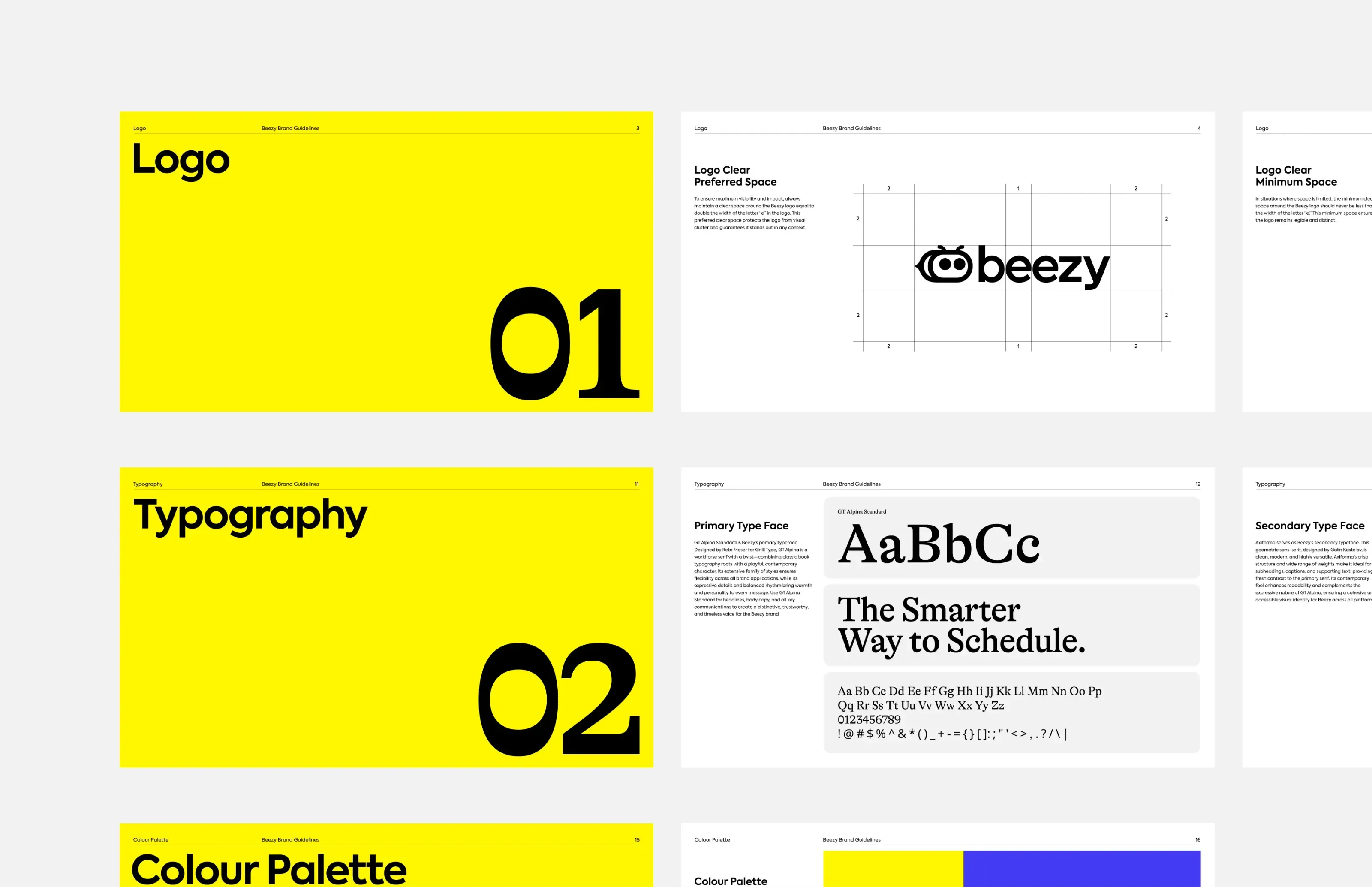
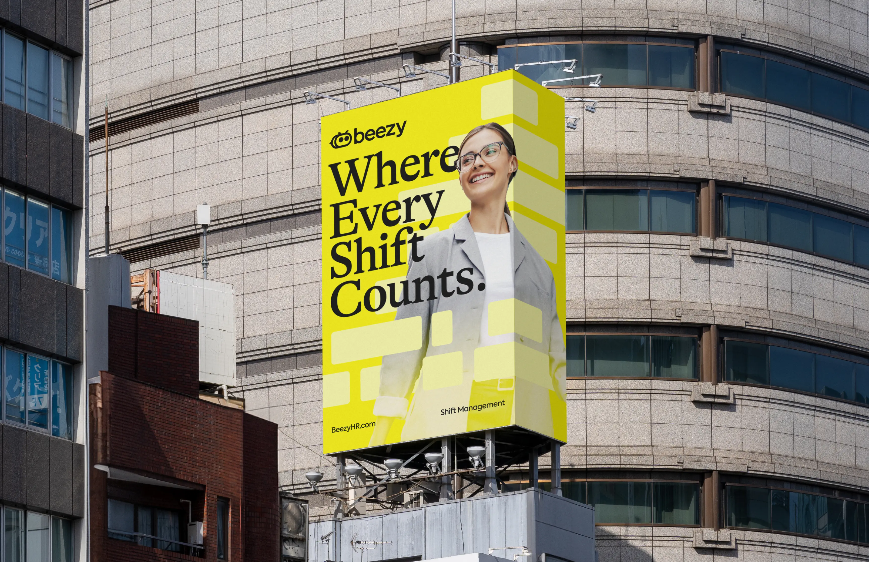
In a landscape dominated by sterile, corporate SaaS identities, Beezy needed a brand that felt playful, energetic, and approachable, without compromising professionalism. We positioned Beezy as the friendly, intelligent platform for workforce management, emphasising simplicity, efficiency, and clarity. Messaging pillars focused on ease, productivity, and team empowerment, giving Beezy a voice that resonates with managers and employees alike. This positioning created a strong foundation for both marketing and product communications.

VISUAL IDENTITY

The visual identity brings Beezy to life with a distinctive mascot - a bee character designed to be slick, professional, and modern. Its stripes were incorporated into the visual system, creating a cohesive design language across digital and marketing touchpoints. The black-and-yellow colour palette emphasises the mascot-based design while remaining impactful and professional. The identity extends across interfaces, marketing, and product design, giving Beezy a distinctive and memorable presence in the B2B SaaS space.

VERBAL IDENTITY

Beezy’s tone of voice is friendly, confident, and clear. It simplifies complex workforce concepts without talking down to users. Every line of copy reinforces the brand’s dual promise: helping teams work smarter while making their day-to-day experience easier and more enjoyable. We developed a consistent brand vocabulary around movement, teamwork, and simplicity, ensuring every communication, from onboarding to emails and in-app messaging, feels approachable and professional.

OUTCOME

Beezy launched with a distinctive brand that cuts through the noise in the SaaS market. Their name captures energy, simplicity, and approachability, while the visual and verbal identity builds trust and relatability. The mascot adds personality without compromising professionalism, creating a memorable presence in a traditionally uniform category. The result is a B2B SaaS brand that is approachable, premium, and ready to scale.

View More Work

Plotpoint

Plotpoint

Identity and strategy design for a story driven marketing agency.

Lab Stellar

Lab Stellar

Building the AG1 of mind, body & spirit.